My team and I at Dallas Theological Seminary just finished putting together a new site that has both a responsive layout and Retina graphics, and I thought it would be worth documenting the decisions we made along the way and some of the tools we used.
We are a pretty small team (we hired the awesome Chris Merritt to do the design and our 1.5 person team [including the awesome Michael Jordan] at DTS did the coding) and had a very tight window (2.5 months) and fairly large site (700+ pages and 2000+ videos and blog posts), so that led us to make some strategic decisions (i.e. compromises) to get it done.
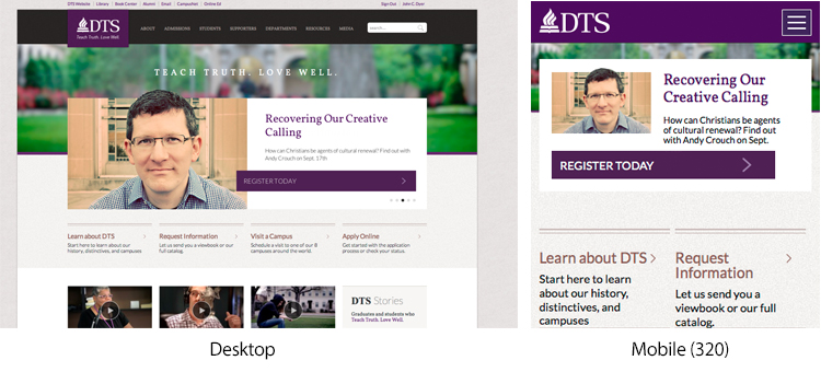
Responsive Layout Plan
In the past we had a separate mobile site (mobile.dts.edu) and I wanted to move to a single site with a responsive layout. We surveyed a lot of responsive sites and found quite a few approaches and ways we could go with it.
Some Great Options
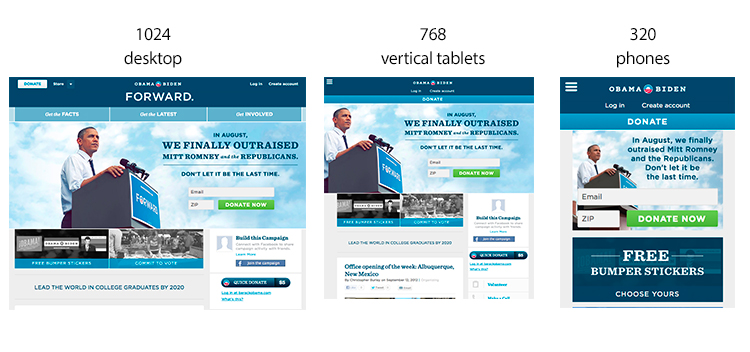
Some have several very different layouts for each of the following: (1) desktop, (2) portrait tablet, and (3) mobile phones. A good example of this is www.BarackObama.com which rearranges its content for each size. Obama’s site is an amazing achievement, but from my perspective there are two main issues. First, it requires an incredible amount of work and time which we didn’t. Second, I personally find that some sites are so different in each layout that its hard to remember or guess where anything will be. For example, in Obama’s case, the big three buttons under the header such as “Get the Facts” are missing in the tablet layout and the “Donate” button gets moved to a more prominent spot.
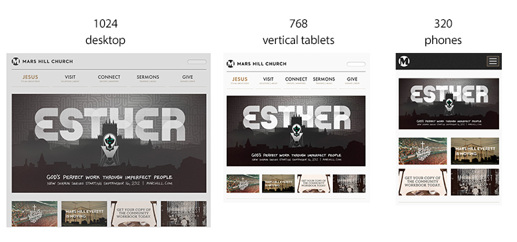
Other sites use a fluid grid to handle both desktop and tablet and then when the screen is small enough (like a phone), the layout collapses. A good example of this is www.marshill.com. I like this simpler and more straightforward approach, but a fluid grid layout wouldn’t really fit with what we wanted to do design wise on many of our subpages.
Our Modified Approach
About 5% of our users are on tablets and 5% on mobile phones, and it seems that tablet users seem pretty adept at pinching and zooming. This lead us to a pretty simple approach: (1) a desktop/tablet site, (2) a mobile phone site where our grid collapses (see above).
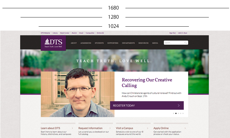
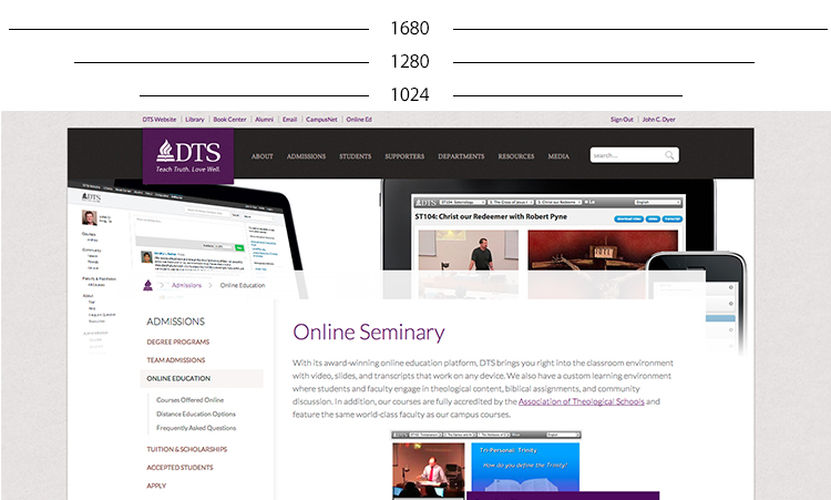
While changing responsive layouts for mobile devices gets a lot of attention, we also wanted to take into account different desktop sizes. This lead us to create a kind of “bleed” that allows the site to look good on older 1024×768 monitors, traditional 1440×900 laptops, and much larger screens. For our 90% desktop users, we now have a site that is “responsive” to their screen sizes without actually modifying the structural layout and placement of content.
Retina (pixel-density: 2.0) Graphics
Right now there are only three main devices that have “Retina” graphics (iPhone4+, MacBook Retina, and iPad 3), but I’m betting that the clones will be arriving very soon and over the life of this site Retina graphics will become an important distinctive, so I wanted to plan ahead to make things look good now and in the future.
Logos and arrows as SVG
Anywhere we have a graphic that’s not a picture (logo, arrow, symbol, etc.) I used SVG (with a fallback PNG). If you go to our site, you’ll see SVGs in our logo, the search icon, and even the social media icons in the footer (roll over the Apple logo for a fun surprise). On a normal computer, the SVG and PNG don’t really look much different, but the difference on an iPhone or MacBook Retina is quite noticeable.
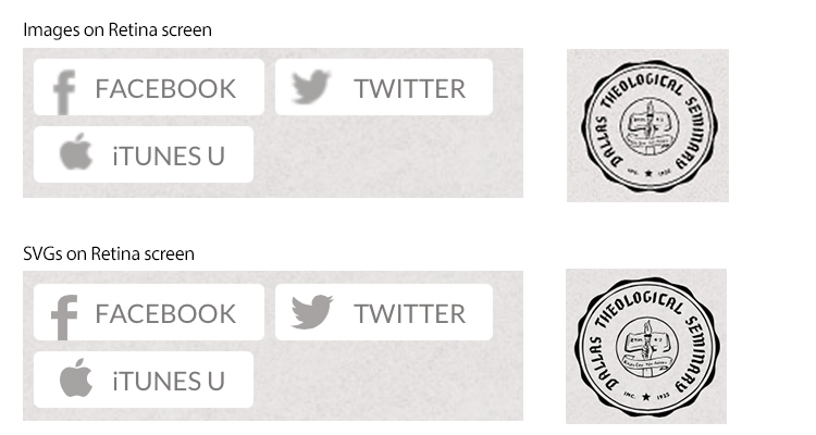
To create the SVGs, I’ve been using Fireworks and Illustrator together. Illustrator can natively work with SVGs, but I couldn’t find a good way to work in pixels to produce the fallback PNGs I wanted for IE8. Fireworks is much better in my opinion for this kind of thing, but it doesn’t have native SVG support (seriously, Adobe?). Here’s the workflow I came up with:
- Use Fireworks to create an icon and save as a Fireworks PNG which retains all vector data (myicon.fw.png). Note: Sometimes I made simple vectors like arrows myself, but I also used some EPS and AI files or the SVGs on www.thenounproject.com and elsewhere. The trick is that you have to open many of these in Illustrator, select the vectors you want, then copy them into Fireworks. Yuck, but it works.
- Save a flattened PNG for older browsers that don’t support SVG (myicon.png). Make sure you keep this separate from the original Fireworks file (myicon.fw.png) so you can work with the vector data later.
- Fireworks can’t natively save in SVG, so I used this amazing “Export SVG” script which does everything you need to create (myicon.svg). So far, I haven’t run into any problems with my images.
- I used the SVG/PNG combo as background images and relied on a class on the <html> tag to tell me which one I needed. I initially was going to use SVG detection in Moderizr, but I went ahead with the HTML5 Boilerplate’s approach of using IE’s conditional comments since I didn’t want to wait until JavaScript fired and possibly download twice. So I ended up with CSS like this:
/* SVG for modern browsers */
.logo {
   background-image:url('myicon.svg');
}
/* applied with IE conditional tags */
.lt-ie9 .logo {
   background-image:url('myicon.png');
}
Pictures with HTML5-ish Markup and JavaScript
The W3C hasn’t quite come to a consensus on a new <picture> element and how the <source> elements should work, so right now you have to roll your own or choose a library. Here was my criteria: (1) Support everyone with a client side approach (no server-side logic), (2) Don’t force Retina users to download images twice (like Apple.com does!), (3) Distinguish between Retina devices with large screens (MacBooks and iPad 3) from those with small screens (iPhones 4).
I decided to go with PictureFill.js by Scott Jehl and use the version that employs <div>s with data-* attributes and a <noscript> tag. On the the backend I created a simple function (in my case it’s in C#) that renders the markup (like <% WriteDoubleImage(“image.jpg”,”image@2x.jpg”) %>), so that I can switch to something like Wilto’s fork that uses <picture> elements or another tool later on when/if browsers start using it. I’m currently only using it for in-page images (not backgrounds) on some key areas of the site, but I hope to add more soon.
<!-- Scott Jehl's markup -->
<div data-picture data-alt="Alt text">
    <div data-src="image.jpg"></div>
    <div data-src="image@2x.jpg" data-media="(-webkit-min-device-pixel-ratio: 2.0)"></div>
    <noscript><img src="small.jpg" alt="Alt text"></noscript>
</div>
<!-- proposed W3C markup -->
<picture alt="Alt text">
    <source src="image.jpg 1x, image@2x.jpg 2x" />
    <img src="image.jpg" alt="Alt text">
</div>
On our homepage, the video thumbnails have a Retina (double-pixel) image for Retina devices and a normal image for everyone else. But the hero rotator only sends Retina graphics to large displays (iPads 3 and MacBook Retina) and sends normal graphics to non-Retina machines and Retina iPhones. On the desktop the hero graphic is 500px wide (1000px on a Retina desktop), but on mobile it’s only 120px (240px Retina), so the mobile Retina only needs the original 500px image to look good. Here’s one of the video thumbnails:

For the Rotator, we also split the image into a JPG and PNG, so that the PNG is just the little sliver that pops above the rotator into the area above (see the top of Andy Crouch‘s head in the first image of this post). If I had made it one PNG it might be 300KB, but the JPG is only 40KB plus a 10K PNG, so this split approach vastly reduces the filesize. Finally, we made the move to Amazon S3 to better handle all the large Retina files.
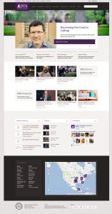
Here’s the entire site on a Retina screen (click for 4MB file)
Room for Improvement, Abandoning Media Queries?
There are still some areas of the site we’d like to go back and add double-pixel images or SVG, and there are a few places where the mobile layout could be tightened up a bit. But the biggest consideration I have going forward is possibly abandoning media queries so that phone users can see the desktop site if they want to.
Here’s how responsive CSS works today (using a desktop first approach):
#container {
    width: 1024px;
}
@media only screen and (max-width: 480px) {
    #container {
        width: auto;
    }
}
But if users hit your site with a phone looking for something that they remember seeing when on a desktop, they have no way of making their phone display the desktop version. One way to solve this is to selectively insert different stylesheets like using something like Nathan Smith’s adapt.js. This way you could turn it off and allow a phone to see a desktop site. Alternatively, you could add a CSS class to root <html> that the user could toggle according to preference. The CSS would look like (SASS/LESS would make this much easier)
/* default size */
#container {
    width: 1024px;
}
/* class applied to <html> tag */
.lt-480 #container {
    width: auto;
}
I’m not sure which approach we’ll go with or if we really need to make the change, but for now we have a pretty solid basis to work from as new devices come on the market. The final consideration I’d like to make is using a Facebook/BarackObama.com like side menu for mobile instead of a drop list.
If you have any other tips you’ve learned while creating Retina or Responsive sites, please share them!
And go check out http://www.dts.edu/ !
We went through similar process and I too was not sure what to do about the “view as desktop” and media queries. At least with responsive design they have access to almost everything the desktop version does. Still it would be good to have that fall back especially when users are on platforms that we haven’t tested on. I am interested to know what path you will choose.
My biggest battle in a responsive design is tables and video embeds. There just isn’t a way to restyle tabular data for mobile. Video embeds are a similar issue. We actually locked our viewport because wide tables would create some weird interactions for mobile users.
You post now has me longin for retina lovin for my site. Now if only I could get a test device.
For the video embeds, I used fitvid.js to make all iframe and video tags responsive. Works great!
Mmm, Google WebFonts. Yummy.
I’ve been thinking about the media queries issue myself. Definitely depends on the site what you want in that regard. I’ve been thinking about ways you could add the sort of toggle you have suggested to all media query elements so that a simple bit of Javascript could essentially disable the media queries (leaving them in place, though, and ready to be kicked back in readily). Something to play with, I suppose.
The redesign looks really, really good. And it’s quick, which I always approve of—anything in particular you did to reduce load times (besides pushing things out to the Amazon CDN)?
Chris,
The only homepage optimization consideration that I think is worth mentioning was that we now wait to activate the Google maps until the user scrolls down to that point. I think we could do the same for the Facebook page and see a speed increase there too. Now that long, scrolling pages are “in,” this kind of optimization will become increasingly important.
You guys really did a FANTASTIC job on this site. All of the hard work, and thought behind it is obvious.
Not to sound super spiritual or anything, but I really think it’s a great witness to doing things with excellence (which you’d hope for in a seminary.)
Well do guys.
Very cool. The design / dev company I work for has only just begun talking about how to integrate Retina-ready graphics. I also really like the huge “mega-menu” drop-down for the top nav.
Just out of curiosity, what kind of content strategy goes into the DTS site? I don’t visit the site that ofter, so I don’t know how frequently it gets updated. But I’d be curious to know how much thought went into the architecture of the sitemap, what the messaging priorities were, and if there was a concerted effort to use design hierarchies to consistently present information types. I do a lot of content strategy for my job and I just think that stuff is really interesting.
The site looks awesome. Great work!
Matt, I’m not sure I can answer this question succinctly in a comment, but the divisions we have are somewhat common to schools although we’ve made some distinctions. For example, many schools separate “Admissions” (the process of becoming a student) from “Academics” (degree offerings), and they have different branding in their “About” (for the general reader) from what you might find in “Admissions” (for the prospective student). We decided to go with one set of messaging for “About” that everyone can see and then combine Admissions and Academics to put all the info you need in one place. Then we decided to really stress all the ways DTS reaches out past prospective and current students by giving “Resources” and “Media” top level menu priority.
Very good summary. Thanks!
One remark: Many Android devices have a device pixel ratio of 1.5. Unfortunately, the pictures – except SVG icons – are not in high resolution available.
Thanks to my father who shared with me about this weblog, this website is actually remarkable.
Très ƅon pooste : pérennise comme cela
Check oսt my webpage – femme coquine
SVG graphics are necessary not only for Retina displays, but for all modern smartphone displays. New phones from Samsung, HTC and Sony have even higher resoultion that the iPhones, which means that all new websites should be made using SVG graphics.
All college students will complete a 15-week work placement
in our on-campus Humber Centre for Healthy Residing.